Since 1991, KC Caps has been a leader in head-wear innovation, styles, materials, and construction features.
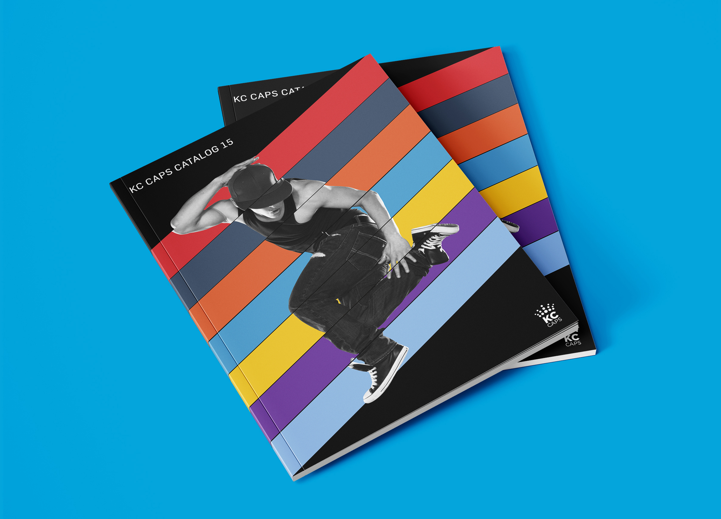
An annual catalog is distributed showcasing the extensive KC Caps inventory. They realised the design of the catalog was too cluttered and poorly designed, confusing potential clients and the sales team. This could harm revenue. I led a small team and we designed a new catalog, using new branding and photography.
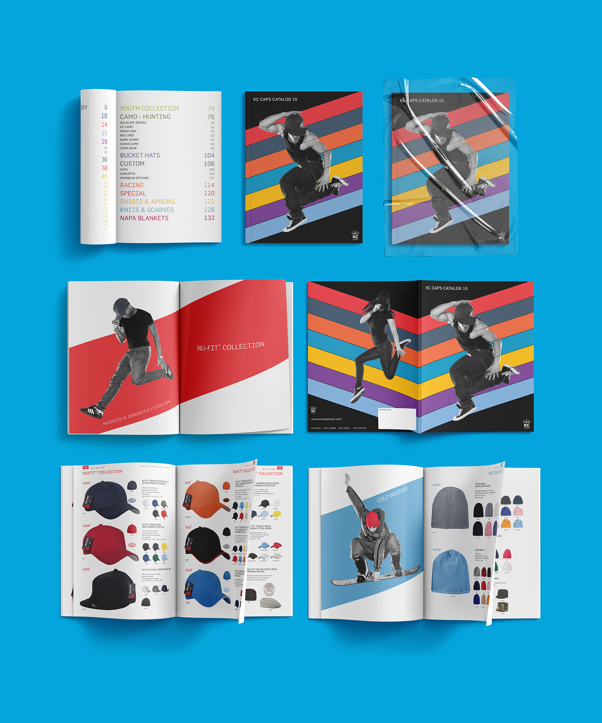
We decided to add sixty extra pages, allowing fewer caps per page, thus increasing legibility. The extra printing cost was small enough to justify the increase in readability and legibility gained.
The newly re-designed catalog needed a theme to tie the various elements together so we created an edgy street youth concept – modern, positive, energetic and active. Los Angeles based fashion photographer E Leon Myers was commissioned. We also designed a new logo, keeping the crown motif, but simplifying it so it can be applied to all media.
Through the use of bold typography, and a logical hierarchy of text sizes and colours, complex sets of information could easily be retrieved and understood quickly. Feedback from sales reps was very positive and revenue increased the year after the newly designed catalog was distributed.